A quick look at some of my work.
Campus Advertising
FBS Marketing
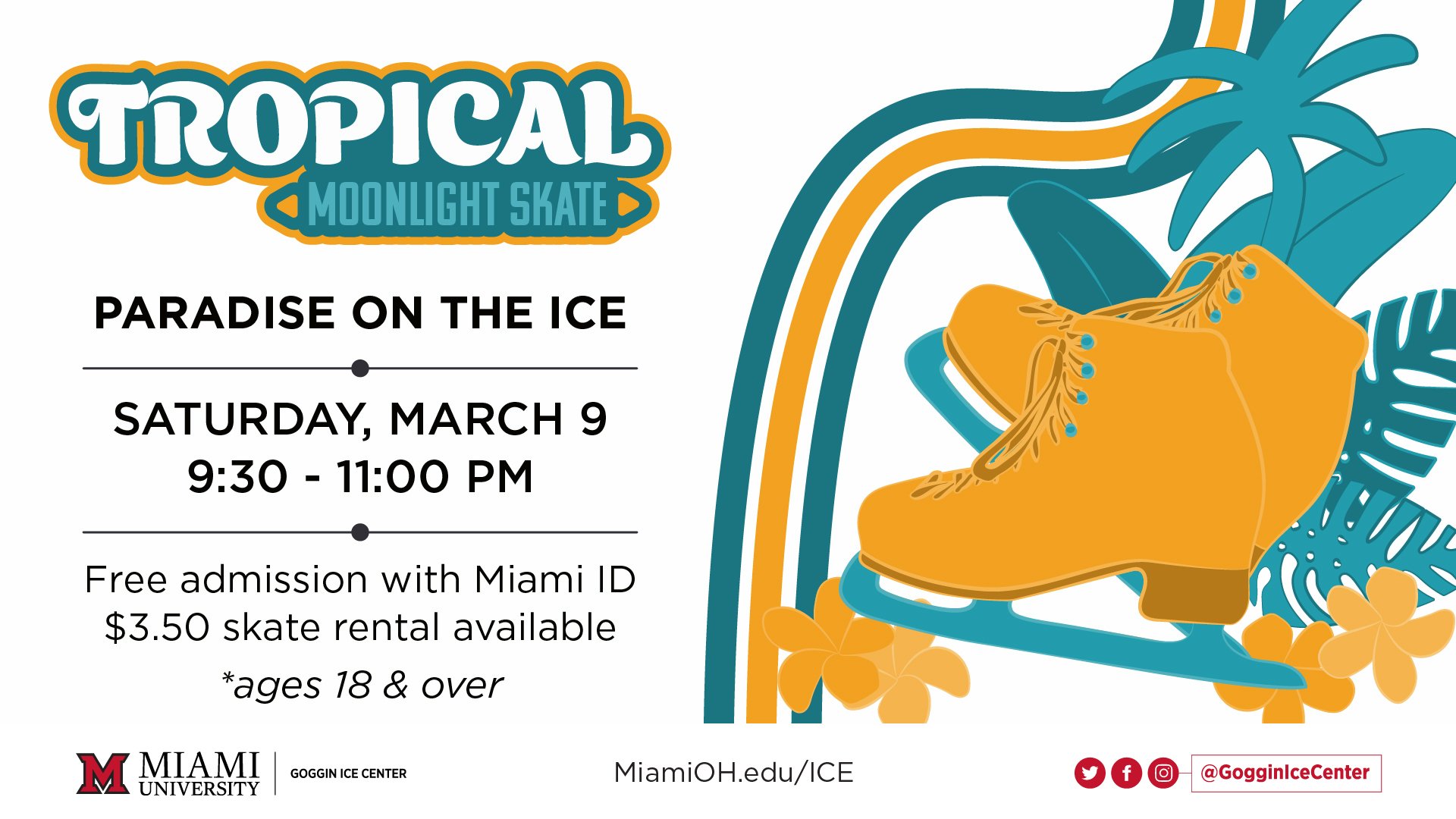
During my time as a Graphic Design Assistant at FBS Marketing, I have worked with multiple clients within and partnered with Miami University. I was responsible for the timely creation of all files, print and digital, to be used in the production of whichever project I took on. In addition, I also ensured that they met Miami University’s rigorous brand standards, where they applied, and consistently communicated with appropriate managers about any confusion concerning project details.
In the creation of files, I was also responsible for creating appropriate event logos, illustrations, and photo editing. When a new file was not needed, I was responsible for making updates to imagery and verbiage as needed.




BIBLIOTONIC
Design Intervention
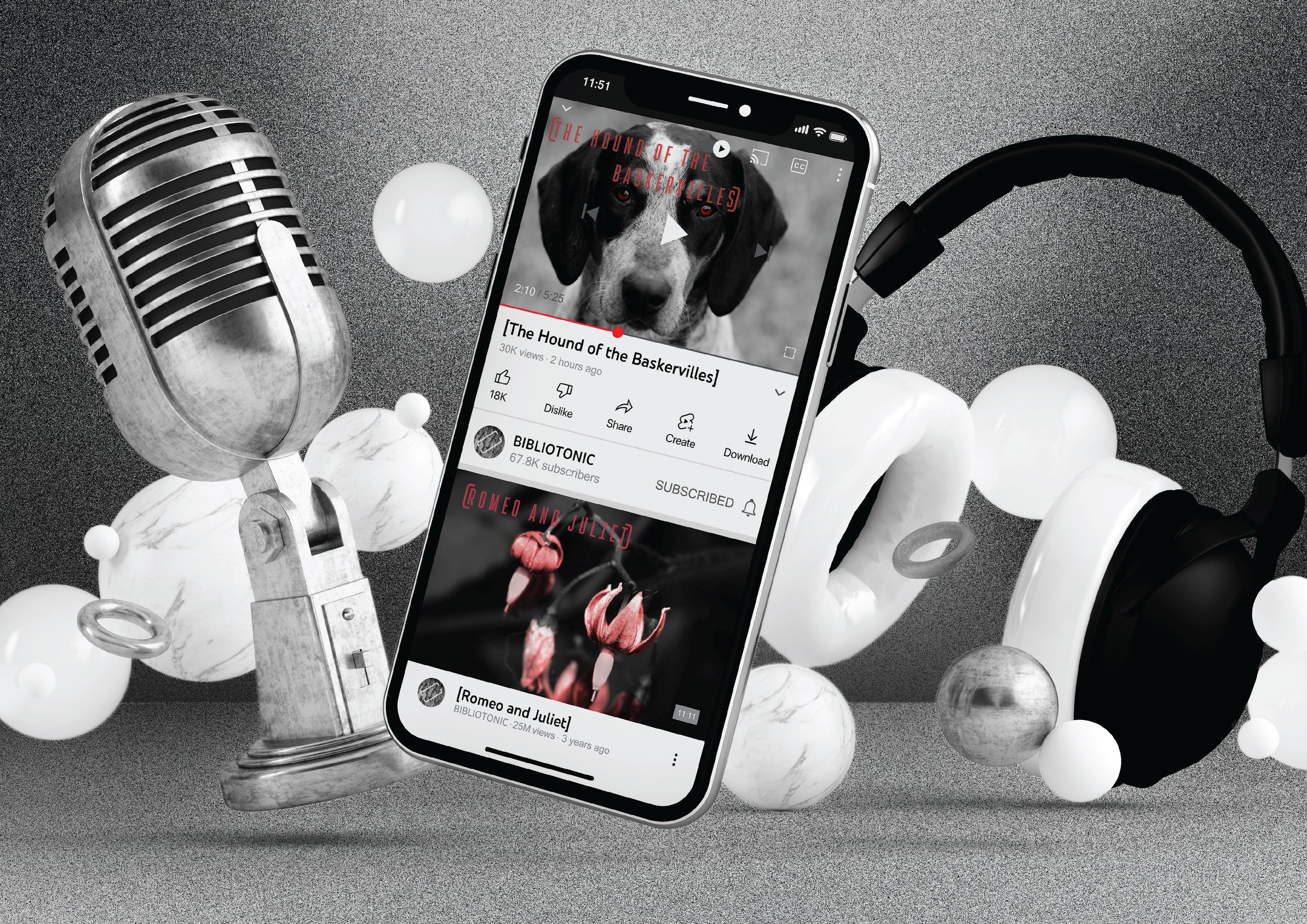
For this project, I was tasked with designing a system solution to a problem I noticed and cared about in the world around me. BIBLIOTONIC is inspired by my desire to encourage interest in classic literature and increase awareness of how books influence each other across time and cultures. To accomplish this, I started by utilizing triangulation with data collected through the Literary Review, Marketing Research, and Informal Interview research methods. After the analysis, a short-form systemized podcast paired with a social media account for channel promotion would best fit my end goal.
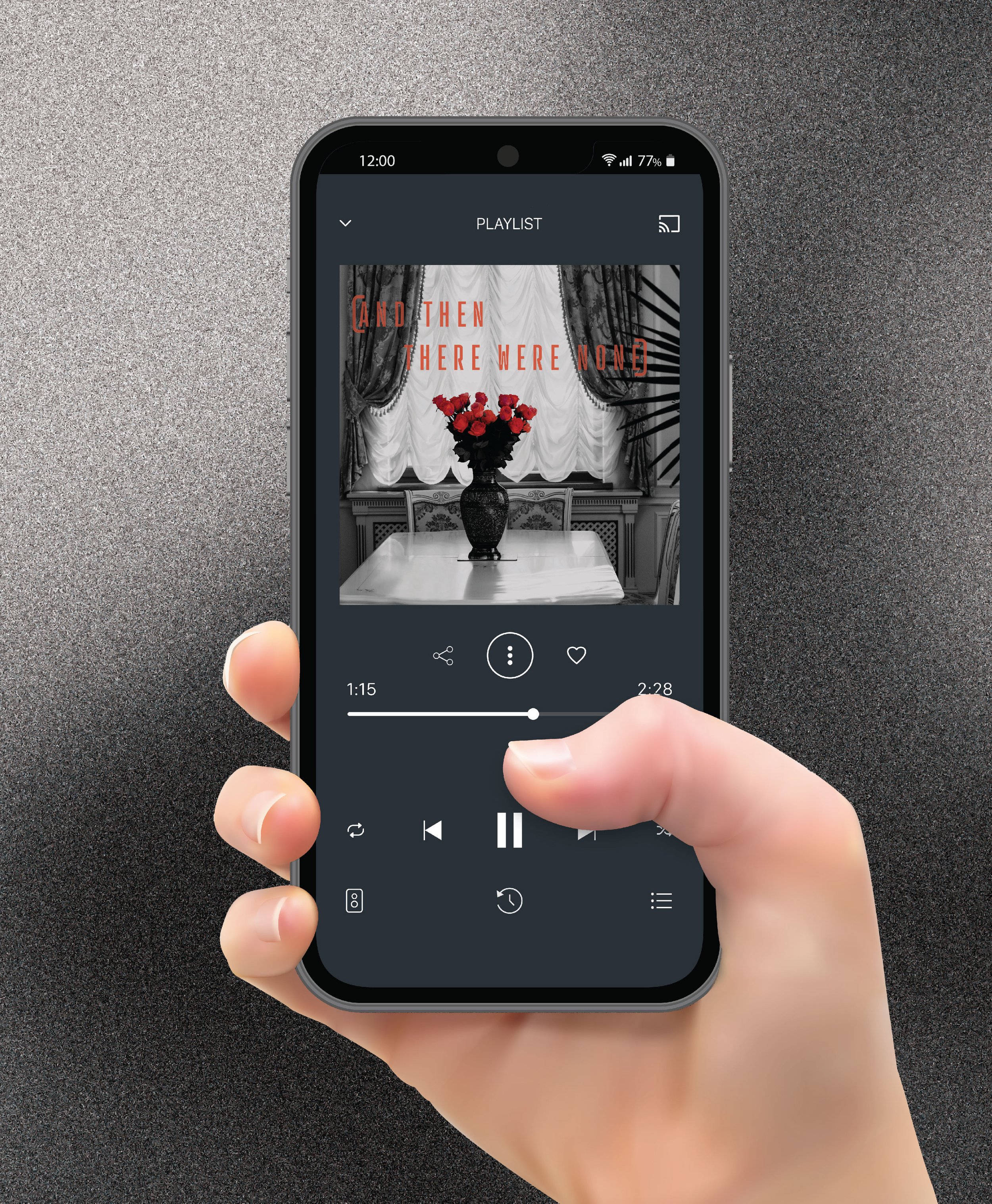
The podcast systems would have recordings released in groupings designated by genre and content. In addition, literary classics from cultures regularly associated with classic literature were incorporated to show the reach of literary influence and give an experience that allows for making connections across perspectives.
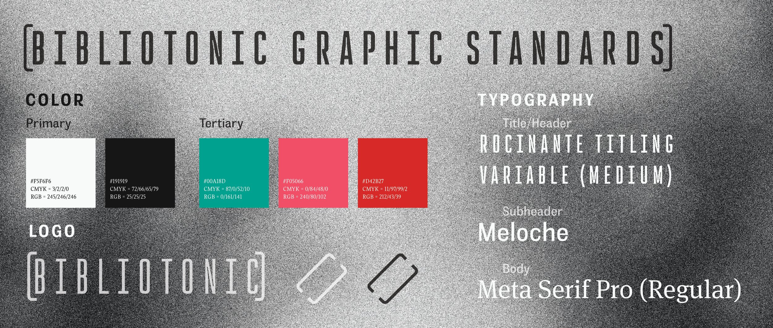
The branding served a secondary function in addition to the usual recognition benefit. BIBLIOTONIC has an overarching brand style that involves black-and-white typography, texture, and photography with each genre having the addition of a single color. Doing this allows for a visual breakdown for the readers engaging with the social media and podcast pages.
The visual style stemmed heavily from genre color associations and the knowledge that books are generally printed in black and white. I tied in a vintage component with the use of black-and-white photos, but the pop-of-color usage brings the modern component I was looking for with my brand style. I really wanted to have a visual representation of the historical influence on contemporary values.


Adapt to Thrive
Highwire
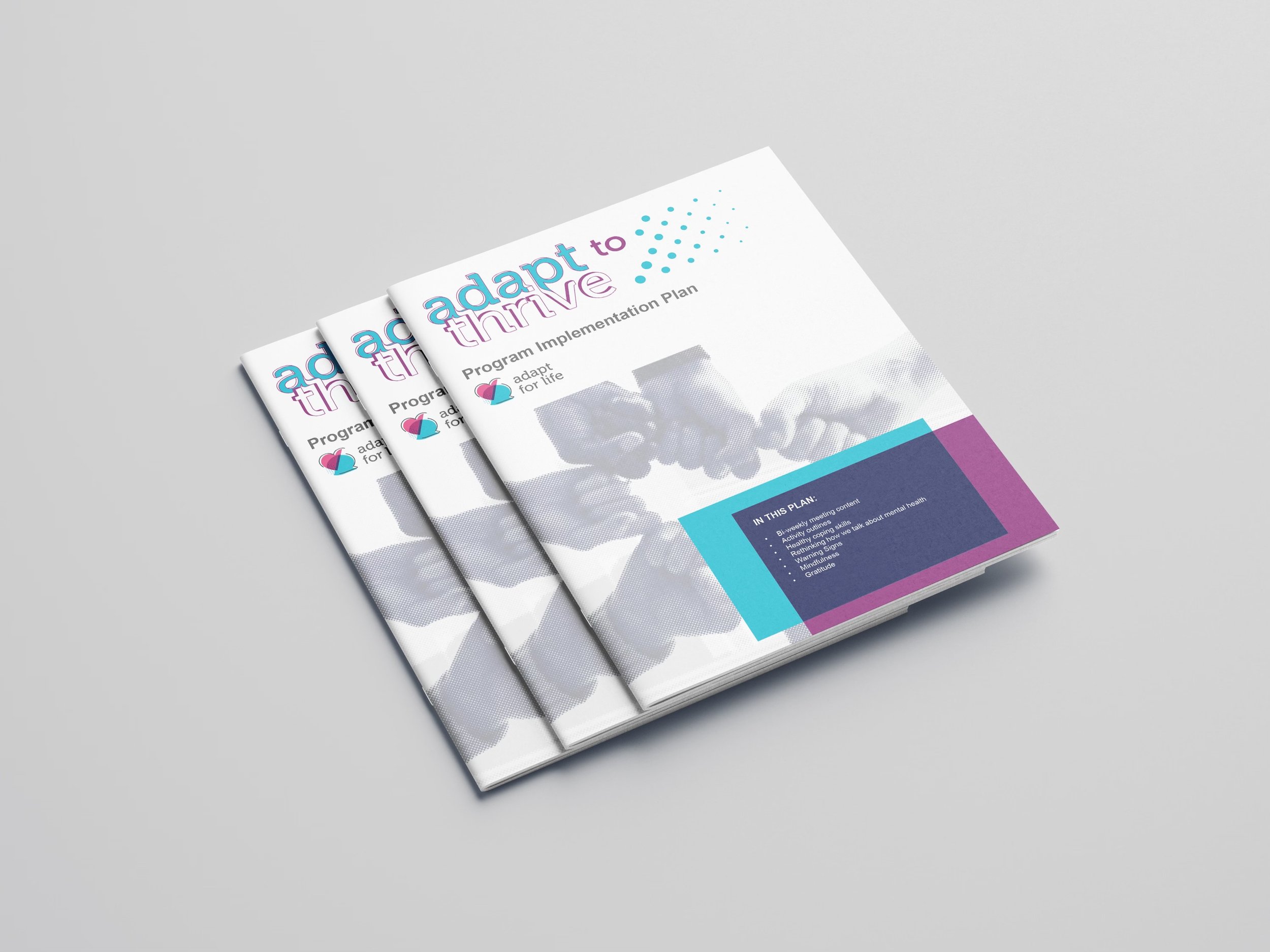
This was a semester-long cross-discipline team project conducted with students majoring in Marketing, Communication Design, and Emerging Technology in Business and Design. Teams were made of a mix of students and competed to get their design and launch campaign chosen by a real client working with the course. In this specific instance, the client was Adapt for Life (AFL), a mental health program backed by Cincinnati Children’s looking to expand the impact of their program.
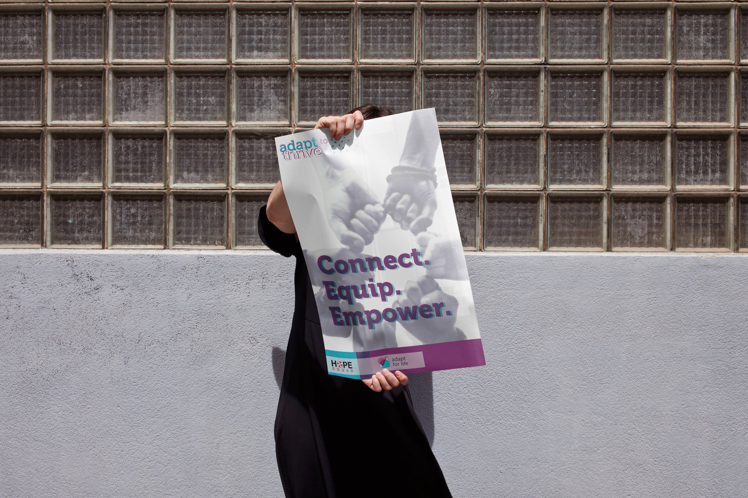
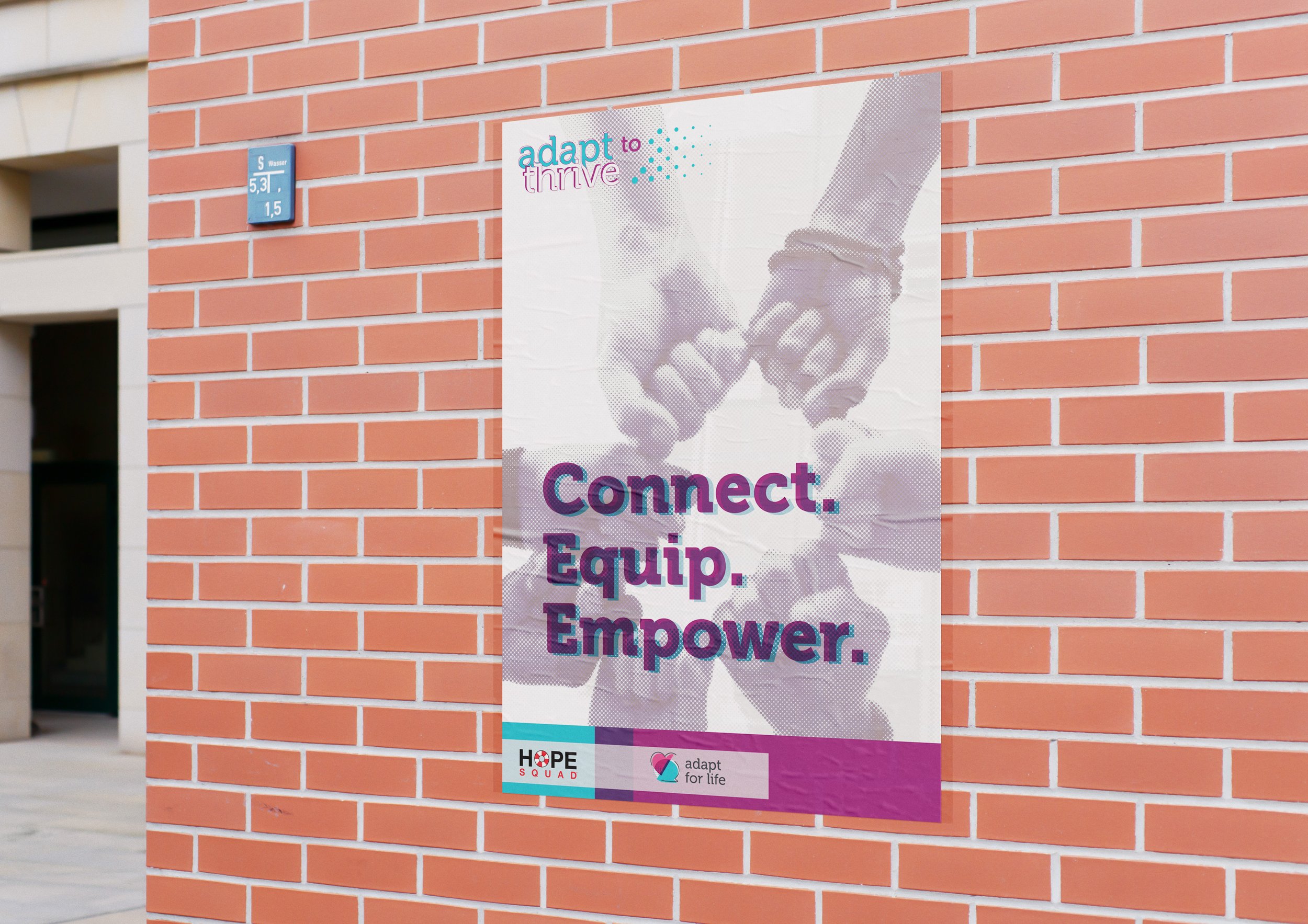
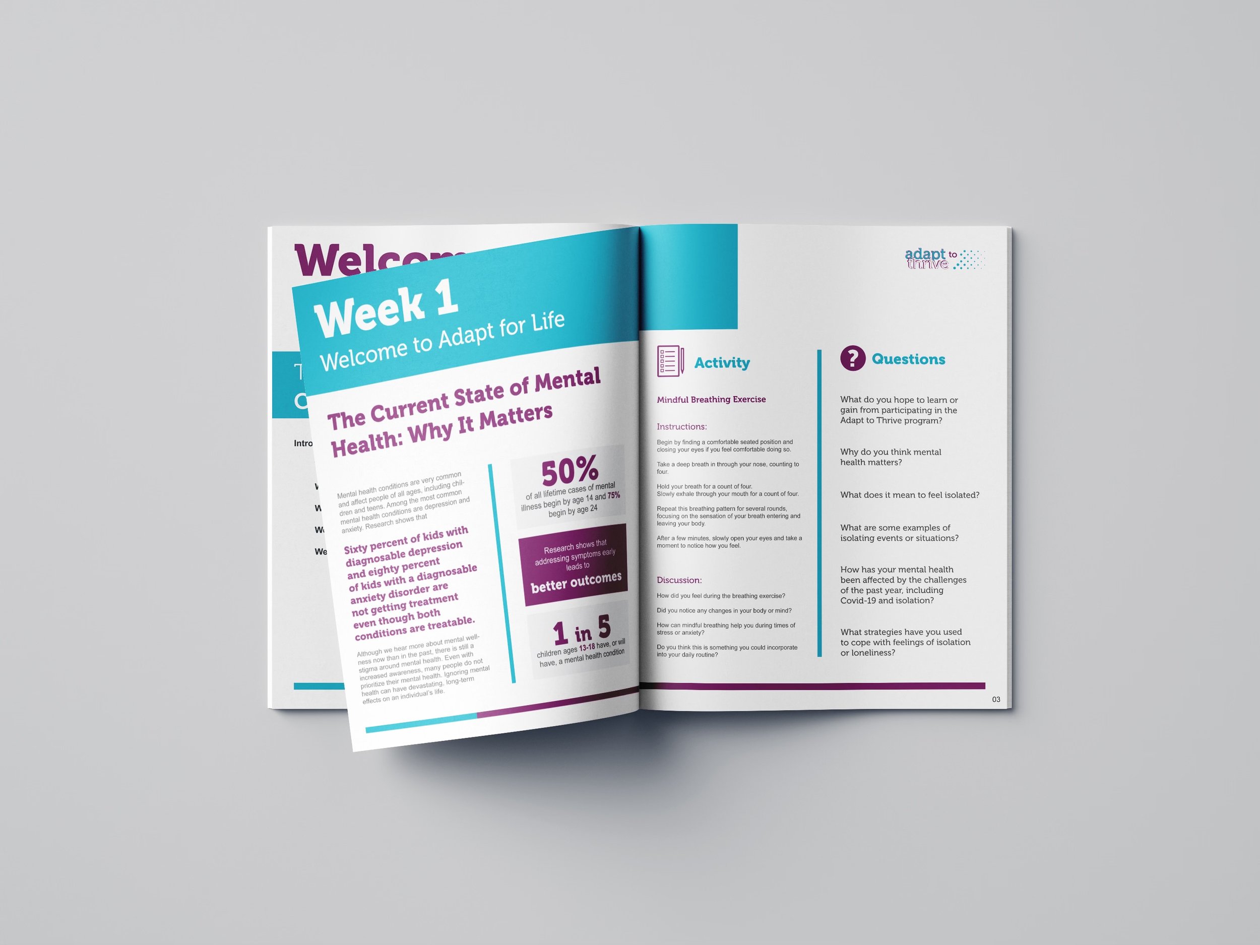
Our solution was to build a brand expansion called Adapt to Thrive (ATT). The expansion takes advantage of structures already in place at schools partnered with AFL to implement short mental health activities suggested by the AFL program and build environments that encourage peer-to-peer connection across the school.
The visuals of the brand expansion included the creation of a new logo and focusing in on the AFL colors and imagery. The new logo took a more typographic approach to show a connection between adapting and thriving while incorporating the common halftone pattern to reflect the numerous students we hoped to reach. We chose to focus the color scheme to create a new feel that would still reflect AFL as the parent brand. New imagery was chosen to reflect more of the peer-to-peer connections as a show of support for incoming students to see the campaign as a way to find community and connection.


